Tuesday 17 May 2011

good and bad website examples

i have searched to find good and bad examples of website designs. a good example that i had found is the website 'Deviantart'
its good because it is clear and easy to find different pages. the fact that the home page has pictures on it makes it attractive and eye catching. the colour scheme of the whole website is good because its not to bright as they are neutral colours, so it gives a clean colour without making it white and bland.
the composition is good because the pictures are the main focus of the page and the links are all close together so their easy to find


this is another good example of a website as its very clear and the links to different pages are in a good place. they are placed at the top and are clear for everyone to see. they also have allot more links on drop down menus that come from the top.this keeps everything nice and ordered. its also good because it shows off its products on the main page, 

this is a bad example of a website as its too colourful and hurts your eyes 
there is to much information on the front page and makes it look to cluttered. 
there is also to many advertisements on the front page and their big so it takes up allot of space. there is also no order on this page so things become hard to find.

  
 this is also a very bad example of a website. the animation in the centre of the page saying enter looks rely unprofessional. the background doesn't fit the page properly so it has been repeated and again looks unprofessional.the page is to empty and there are no images   
  

Thursday 17 February 2011

website plan

This is the design of my website. I was originally going to have the text in the middle for all pages and have text links or buttons but after my research i had developed better ideas and had come up with this idea. The main page is in the center of this sketch. then the layout of the other pages are relatively the same.

Wednesday 16 February 2011

evaluation

My website was designed to be based around the manga artist Yana Toboso. The first things I did was to research what books she had created. After that I had to research and find out what those books were about. After getting this information I was then able to design and create a logo. My logo has some aspects of both of her books. I also needed to do research of other websites so that I could get ideas for my own. I managed to find a couple websites that were unique and different. This research helped me as it had then given me ideas on what I could do for my website.
To complete my project I had used flash. I used a mixture of traditional and digital methods to capture the stuff I needed for my website. First I had use a graphics tablet to draw the backgrounds. And then after I had gotten my traditional stuff I then went onto using a digital method in flash to create my scroll bars.
I think that the success of my project was the visual aspect. As the lace brush tool that I had used showed of the style of the manga Yana Toboso had written. Also with the images on the main page that I had created were good because for anyone that had read her books they would be able to tell what this site was about

In this project I like using the scroll bar in my work as it gave a professional feel. It also makes the page look tidier and less cluttered if the text is in a small box. I would like to use this again in my future projects because it organises everything and makes it easier to navigate around.
Some of the research I did for this project helped for example the research I did about the layout of websites helped allot because it gave me ideas about how my website could look. But the research about the history of my capture method which was drawing didn’t help me at all.

If I were asked to do this again I would have spent allot more time in doing research so I could get more ideas on what to put in or on my website. I would also have used scanning so I could put textures onto my website because it might have made it look more interesting and appealing  
Over all with this project I managed to learn how to create links and scroll bars in flash and I also learnt about different layouts on websites. My overall opinion of my website was that I could have added in more things to make it attractive and I could have added more information and text

Wednesday 9 February 2011

design for my main page

After looking at and visiting various other websites I had found a design that I liked.  In this design it was different to other websites as when ever you scrolled down on other websites they would have the whole screen scroll down but on this certain website that I had found the only thing that scrolled down was a box with the text inside of it. I decided that I would be creating my website like that as it is new and original. Another thing that I had come across when looking and visiting other websites was the use of images as links. I think this is a very good idea because it is more attractive then having text every were but it does also have a fault as if there is no information telling the person were to click and were it takes you then no one would know and they are more  likely to not make it past the first page. So I have come to the conclusion of adding in underneath the text box an explanation as to were you have to click to go to the other pages. Overall this research has helped me decide on the layout of my page and how I shall be creating links in interesting ways,

Tuesday 8 February 2011

3d text in phototshop


first get a black background and double the layer then create a gradient from black to white and then
create a text layer over the top after that whist on the text layer go to 3d Repousse and then text layer.

Wednesday 2 February 2011

Unit 1: Capture

AssignmentOverview


This assignmentis aboutinvestigating and producing capture work ina chosen media or medium.


The assignment is divided into five stages:


z Stage 3:Exploringandexperimenting
http://aliciapca.blogspot.com/2010/09/health-and-safety.html
http://aliciacapture.blogspot.com/2011/02/3d-text-in-phototshop.html
http://aliciacapture.blogspot.com/2011/02/3d.html
http://aliciacapture.blogspot.com/2011/02/3d-typogrphy.html
http://aliciacapture.blogspot.com/2011/01/wordle.html
http://aliciacapture.blogspot.com/2010/12/buttons.html
http://aliciacapture.blogspot.com/2010/12/this-is-my-animated-logo-that-i-made-by.html
http://aliciacapture.blogspot.com/2010/11/movie-poster.html
http://aliciacapture.blogspot.com/2010/11/paths.html
http://aliciacapture.blogspot.com/2010/11/shatter-effect.html
http://aliciacapture.blogspot.com/2010/11/adobe-illistrator-basics.html
http://aliciacapture.blogspot.com/2010/11/360-panorama.html
http://aliciacapture.blogspot.com/2010/11/texture-tutorial.html
http://aliciacapture.blogspot.com/2010/11/dclr-camera-tutorial-induction.html
http://aliciacapture.blogspot.com/2010/11/square-apple.html
http://aliciacapture.blogspot.com/2010/11/this-picture-is-made-up-of-three-other.html
http://aliciacapture.blogspot.com/2010/11/pool-ball-tutorial.html
http://aliciacapture.blogspot.com/2010/11/slicing-in-photoshop.html
http://aliciacapture.blogspot.com/2010/10/identity-poaster.html
http://aliciacapture.blogspot.com/2010/10/we-made-shape-out-of-letters-way-we-did.html
http://aliciacapture.blogspot.com/2010/10/3d-typography.html
http://aliciacapture.blogspot.com/2010/10/typography-t-shirt-design.html
http://aliciacapture.blogspot.com/2010/10/graffiti-t-shirt-design.html
http://aliciacapture.blogspot.com/2010/10/identity-t-shirt-design.html
http://aliciacapture.blogspot.com/2010/10/marantz.html
http://aliciacapture.blogspot.com/2010/10/blog-post.html
http://aliciacapture.blogspot.com/2010/10/shop-window.html
http://aliciacapture.blogspot.com/2010/10/roy-christie.html


Tuesday 1 February 2011

3d

to make this 3d i multiplied the layer and then named one blue and one red
for the blue layer go to image , adjustment , curves
change the channel to red. click in the middle of the table and change the output to 0 and 
change the input to 251

then for the red one change the channel to green and the output and input to the same numbers as the blue one
then do this again with the red layer but instead of green change it to blue

then after change the blend mode of the on top layer to screen
and then move the top layer to either the left or right to give the 3d effect 

3d typogrphy


this was made in photo shop. we created them in wordle and then merged them together in photo shop buy turning the layers to 3d post cards. and merging them together After we used the rotate tool in photoshop to chnage the prespective or veiw. after we were happy with the angle we could then also go back and change what each layer looked like by double cliking the layyer and then changing it in a new window 

Tuesday 25 January 2011

link bar

this is what you would use to go to different pages for example if you click on the first character then it would go to the characters info page.
i had thought of this idea when i was researching websites and i saw that most links are either text or a button so i thought to make the page more atractive i could use pictures instead

Wednesday 19 January 2011

Tuesday 18 January 2011

wordle

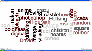
today we captured with words what represented us. and then we did one for another person with the website called wordle. then we printed them out and put them together as a poaster

Tuesday 11 January 2011

website proposal 2

                                       
change of my website


After a lot of thought I have decided to change the focus of my website from cosplay to a website about the manga artist Yana Toboso and her art work and her books called kuroshitsuji and Rust Blaster. I have chosen Yana Toboso because she is my favourite manga artist and I have more interest in manga then I do in cosplay.

There are already existing website which has created the same thing I want to create for my website. Some examples are the Wikipedia about her as I want to have pages that tell you about her and her life and how she became an artist, 
Another website would be the official wiki for one of her mangas called kuroshitsuji. This website is good for information as it tells you everything about her book for example the characters, the plot ECT. And it has a nice layout because of all the pictures, which I find good as the books she creates are just pages of pictures so the website kind of represents a manga in one way. But although it has a lot of picture the page isn't really very attractive as the pictures are on a plain white background. I can’t say much about the logo for this website as this website is a website for lots of other information about different things but I think that they could have incorporated the manga into the logo somehow. Like changing the font to an old England font because the setting for this manga is in old England    

Another website like one I want to create would be the wiki about rust blaster this one has allot of information about the manga but unfortunately it doesn’t have any pictures and the whole page looks bland and unattractive so this page doesn’t really portray the manga or anything about Yana Toboso in the logo or page design.

In my website I want to create a home page with allot of illustrations of her books to make it attractive. Then I would make a separate page about Yana Toboso and how she became a manga artist, a page dedicated to kuroshitsuji and another page about her second book rust blaster then I would have pages about what new stuff she is working on and fan artwork that has been created by others.
I will create a logo that has some aspects of her books in it and the website background will have elements of the mangas incorporated

My research has proven to be use full as before I had done any research I had no idea that she had created another manga. Also it has helped me see that there isn’t an already existing website that is like the one I want to create.
Research has also helped me come up with ideas for the design of the backgrounds for each page   

My method of capture will be the use of drawing using tablets into Photoshop for backgrounds and to draw her characters in my style. I will use scanning to scan in some pages of  one of her mangas
I will use flash for some vector drawings for example the buttons
I will also be using fonts as a form of capture
And I will use sounds for the button clicks 

my capture method history

The very first drawings were from cavemen in prehistoric times. They were very limited in detail and were made from very simple shapes. There were only ever two colours used; black and brown. But they were noticeable as to what they were. Their drawings were made to tell stories as they didn't have an alphabet yet.
And they were always found on walls.
Later drawing developed and there were more colours used. Their drawing style changed and they had more
detailed pictures. Also they had developed a type of paper called papyrus this made it easier to pass on the information because it could be stored and looked after. They started to develop their own type of alphabet so pictures weren't use as much as the prehistoric times to tell story as they could just Wright it.
Then when we get to the roman times the drawings obtained allot of detail and tones of different colours. In this ERA they also started to use shading and lighting in their pictures. The people were very detailed and were realistically drawn. This was drawn on a canvas as they developed something better that papyrus. There are no words on this drawing as they no longer used drawings to tell story's or information because they had a fully developed alphabet that was used in allot of places  
Soon people started to just draw for work or hobby. And because the drawings were no longer needed for telling stories they could be made to look as strange as they like to capture people’s attention for selling purposes. Or the artist could just let their imagination flow and because of this many drawing styles were created e.g. abstract, surrealism, cartoon, fantasy and many more

Then when technology developed we were able to draw on the computer. As the technology got better and better, people were able to create detailed realistic images of people but because of the technology then they were able to add things to the people that would not normally be there e.g. wings and because ad the high quality technology it looks so real that it could be a photo

digital drawing 

In the mid 1960's the only individuals that were involved in digital art were scientists or engineers because they were the only ones that had access to the equipment.
Then artists started to explore the uses of computing technology as a means of creating art. In 1962 DR. A. Michael Noll programmed a digital computer to create visual patterns only for artistic uses.
Some of his late computer generated patterns helped create other artists work like Piet Mondrian and Bridget Riley and theses paintings later became classics. the first devices that allowed us to create digital art was the 'Henry Drawing Machine' that was created by Desmond Paul Henry. Because of the invention of his machine he was granted the privilege of a one man show so then his work was shown in the Ried gallery in London in 1962,
later in 1963 Joan Shogren created a computer program that was based on artistic principles. The first two digital art exhibitions were held in 1965. The first was held in April 1965 at the Howard Wise Gallery in New York, and Generative Computergrafik. The second was held in February 1965, at the Technische Hochschule in Stuttgart, Germany.  The names of theses exhibitions don't contain the word 'art' as this was not yet acknowledged as art
in 1968 the institute of contemporary arts hosted one of the most influential exhibitions of computer art. This exhibition featured many of people which were often seen as the first true digital artists. A year later the Computer Arts Society was founded in London

The first computer art program was created in 1970 by Katherine Nash and Richard Williams and was called ' ART 1'


Anime art 

Anime began at the beginning of the 20th century. The Japanese film makers started experimenting with techniques of animation that were being used in the west. In the 1970’s anime was developed further and separated completely from its western roots, and started developing distinct genres such as ‘mecha’. Some of the shows from this period are Lupin III and Mazinger Z. Also during this period a couple film makers became famous especially Hayao Miyazaki and Mamoru Oshii. In the 1980’s was accepted into the mainstream in Japan and became more popular in production. Because of the rise of some films including a film called ‘Akira’ this set records in 1988 in the production costs of film production. And the film 'Akira' soon after became a success world wide. In the 1990's and 2000's


Because of the development of technology we have been able to create more complex drawing whether it is digital or traditional. For example with the creation of Photoshop in 1990 you were then able to do more affects in digital drawing as Photoshop filters were then introduced.