
Wednesday, 20 October 2010
shop window
roy christie

we had a street artist come to collage and talk to us about how he became a street artist and the stuff he does with the children that want to be street artists as well. then he told us to make our own graffiti so we were given a piece of paper and a pencil and we drew our own graffiti
banksy's movie review
we saw a movie that was made by banksy. it told us about a french man that used to sell clothes in la. but he filmed everything he did. the movie showed us about all the different street artists and how they did their art and how the french man soon developed his own Passion for street art. in the end he became a big street artist and he called himself Mr. brainwash. i didn't like him because he started from not doing any art and within a year he claimed to be a professional artist. i also didn't like him because he advertised himself allot.
but i did kind of like his work because he made a giant robot out of TV's.
but banksy's movie was very interesting because it showed us how they worked and what they thought of their art and how they helped mr. brainwash
but i did kind of like his work because he made a giant robot out of TV's.
but banksy's movie was very interesting because it showed us how they worked and what they thought of their art and how they helped mr. brainwash
identity poaster

typography experiment


then we made a different type of typography instead of it making a shape we made i follow a line all we did for this one was we made a path with the pen tool and the selected the text tool and clicked on the path and then what ever we wrote followed the path
 then we made warp text the way we did this was realy simple and easy.we clicked the text tool and then wrote what we wanted on the canvas and then cicked a button at the top called warp text then a small window came up and we could change the text as much as we wanted
lastly we had to try to make a face out of typography. to make this the first thing we did was took a photo ofouself andthe we tunred the saturation to grayscale and then we whent to filter galery and chose cutout after that we played around with the bars on the right to make te face have simple shapes. after that we selected the magic wand tool and clicked on a part of the image then w right clicked and selected make work path then after that we got the text tool and wrote inside of it and we repeated this for each part we wanted to wright in
astor park poster

the way i made this poster was i put a tone of pictures on top of each other but on separate layers and then used a very big soft eraser and rubbed out the parts i didn't want so then the graffiti which was originally from different pictures looked like it was merging together . then i downloaded a new font and then used that in white above all the layers once it was put were i wanted it i made a clipping mask and added colour using a big and soft brush to give it colour. after that i used a low opacity eraser to make the text fade
at first i didnt like how the text stood out so i changed it and made it fade in to the picture
Tuesday, 19 October 2010
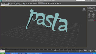
3d experiment

after that we made 3d typography. the way we did this was we clicked shapes and then a list came up so we selected the text option. then we clicked on the screen and then we chose modify. we went to modifier list and chose extrude. this made the text 3d. and after that we cloud move it and rotate it were we wanted
after we made a box and right clicked on it and chose convert to and then we chose convert to editable poly. we were then able to shape it by using the vertex and polygon tools. then we selected polygon and clicked the extrude box and then we were able to move each section of the box either out or inwards after we were finished moving the boxes we went to modifier list and selected turbo smooth this made the boxes edges smooth.


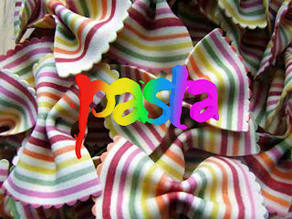
the way i made this image is i made my text in the 3d program and then i saved it as a png and opened it up in photoshop after that i got a picture off of the Internet and put it as a background. the way i coloured the text with a rainbow is i added a clipping mask above the text layer and coloured were i wanted the colours and then i just lowered the opacity
Monday, 18 October 2010
typography t-shirt design

graffiti t-shirt design

in this design i Incorporated my graffiti i drew earlier and changed the colour so that it looked like the text was drawn on top of the t-shirt and then i added a rainbow affect underneath to make the text stand out. i did a different colour for each letter so you could distinguish each letter.
identity t-shirt design

i used the brush tool to get the text because i wanted a ruff look to it. for the bright colours i used a very big and soft brush and just tapped the picture. i did this on the masking layer.
and i made another making layer to add the lines onto it.
i changed the colour of the shirt by pressing 'ctrl' and 'u'. i then changed the bars till i got the colour i wanted
marantz
today we learned how to use and set up a marantz.
we pluged it in by a mains cable but you could also use battries if you are out side and not able to get to a mains suply.
there are 2 diferent type of microphones. one type of microphone is hidden in a tube so that you could direct were you whant to pick up sound.
the other is like a microphone that singers use.
we were showed that the 3 digets at the top of the screen tell you how many recordings you have taken and the numbers at the bottom of the screen tell you how much recording you can record.
we were taught which ends to plug into the mic.
after that we had a go at recording some stuf.
after we recorded we listened to it and we found that the microphone picked up alot of sound
there are many formats you can record in e.g mp3
Wednesday, 13 October 2010
grafiti: mixed media
today we made a grafiti picture with scanning, photography and drawing with photoshop over the top of the scanned picture.
we also used typography but incorperated it into the other pictures so it looked like it was part of the whole picture. but we had to makle the whole thing in gray scale
we also used typography but incorperated it into the other pictures so it looked like it was part of the whole picture. but we had to makle the whole thing in gray scale
Tuesday, 12 October 2010
graffiti
today we researched about graffiti. we found out that the most earliest type of graffiti was in the 30,000 Acd on cave walls.
the earliest modern graffiti was in Rome . in the 1970's there was allot of movement with the graffiti art and people started trying to sell their art.
we also found out that there are different types of graffiti. there is booming and tagging, and a couple more
today we tried to draw some of our own graffiti and we wrote the word capture but i decided that i would cut out the letter u and e and then i also joined up the letterers and made them.
Monday, 11 October 2010
street art
today we looked at street art and one of the artists we looked at was banksy. he has done allot of art. his identity is hidden but he is known by many people all over the world. my favorite piece of work was when he painted an elephant in pink and gold face paint. i liked it because it was very different from any other street artist and it was bright. some people argued that it was wrong because it is animal cruelty . but i think that it is fine because it isnt hurting the animal

 i like this piece of work because he has taken a childs cartoon and incorparated himself into it.
what i dont like about his work is that its cind of cometialised to give him more bublisity.
-------------------------------------------------------------------------------------------------
the next person we looked at was mr.brainwash. he was origanaly selling rip off clothing in la
what i dont like about his work is that its cind of cometialised to give him more bublisity.
-------------------------------------------------------------------------------------------------
the next person we looked at was mr.brainwash. he was origanaly selling rip off clothing in la
Wednesday, 6 October 2010
david carson
david carson was born in 1952 on the 8th of september in corpus christi, texas
the magazine of graphic design USA made a list of the "Most influential graphic designers of the era" and they listed david carson as the 5th most influential designer, along with Milton Glaser, Paul Rand, Saul Bass and Massimo Vignelli.
He was the art director for the magazine 'ray gun'
david carson worked as a teacher at Torrey Pines High school during 1982-19.
then In 1983, Carson started to experiment with graphic design and found himself immersed in the artistic and bohemian culture of Southern California. By the late eighties he had developed his signature style, using "dirty" type and non-mainstream photographic techniques. He would later be dubbed the "father of grunge."
carson then whent on to work in the magazine called transworld skatebording
he was a profetional surfer and in 1989 he was named the 9th best surfer in the world this led to
Steve and Debbee Pezman, publishers of Surfer magazine asking Carson to design Beach Culture

i like his work because he uses lots of sizes and fonts of righting and it isn't all just the same size another reason why i like it is because of the use of bold colours in the typography so it stands out.
i don't like that there isn't allot of imagery in his work and i didn't find it visually entertaining
Tuesday, 5 October 2010
history of drawing

and they were always found on walls.

detailed pictures. also they had developed a type of paper called papyrus this made it easier to pass on the information because it could be stored and looked after. they started to develop their own type of alphabet so pictures weren't use as much as the prehistoric times to tell story as they could just wright it.


capture mind map

i found that you can draw, photograph, record, film, colect, memorise, wright and do imprints to capture.
Subscribe to:
Posts (Atom)