Neville is an English graphic designer, typographer and art director. he has designed record covers for artists like cabaret volaitre and depeche mode.
He created the company Research Studios in 1994 and is a founding member of Font works
when he was young he studied fine art. his teachers weren't fond of his work and called it 'uncomercial'
by 1977 punk rock was begining to have and effect onlondon life. this had a grate impact upon brody's work and motivation but was not well received by his tutor.
Wednesday 8 December 2010
Tuesday 7 December 2010
buttons
we had a canvas with 4 different colours at different frames. then we went to window, common libraries, and then buttons, oval buttons and then i placed 4 on the left hand side of the canvas then we put text on each different background saying different things e.g about, links.
after that we got up the action window
then went to global functions, time control and then go to and play, once we had done this for each button we were able to use them to take us to the frames we wanted them to
after that we got up the action window
then went to global functions, time control and then go to and play, once we had done this for each button we were able to use them to take us to the frames we wanted them to
Wednesday 1 December 2010
first off we were shown how to create a frame by frame animation in photoshop and we had to create one for a clothing line called 'Lift off clothing'
once we had done that we were then asked to create one for our own website or logo so i created this animation.
i liked the idea of having the girl blink at you so i had made her blink to make it stand out a bit more. i also tried to make the text look like it was being written on
Tuesday 30 November 2010
website layouts
i have looked at a couple different website designs to collect ideas for my future website. i went on 99designs and it shows a range of other peoples website designs.
 i found this design and i like the way it has the picture in the middle of the screen and has a dark outline.
it makes the picture stand out. as when you look at the screen the first thing you look at is the image of the girl,
the downside to this design is that it detracts from writing that might be important. and also the use of these dark colours makes it hard to read the writing
 i also found this design. i like how all the pictures are in an order and the page looks clean and not messy or cluttered. everything is clear and bright. the thing i don't like is the way it's a bit plain and there's not much colour

it makes the picture stand out. as when you look at the screen the first thing you look at is the image of the girl,
the downside to this design is that it detracts from writing that might be important. and also the use of these dark colours makes it hard to read the writing

Sunday 28 November 2010
i phone web page
we had to design or own web page for an iPhone. my iPhone web page is similar to my normal web page. it has the same colour theme. the only thing that is different to the normal one is i still has the original logo which i needed to change and it also doesn't have the Plymouth cosplay mascot on it.
 i created a mascot because at first on my normal web page it was empty. so i made a mascot to fill that empty space and also to make a recognisable image
 i created a mascot because at first on my normal web page it was empty. so i made a mascot to fill that empty space and also to make a recognisable image
 slicing in photoshop
we were told howto make sertain parts into links to other pages for websites, the way we did this was we opened photoshop with the website page.
 once we had done that we chose the slice tool wich was with the crop tool. we selected a part thatwe wanted to make a link. for examplethe text on this would be a link so i selected them
 hen i used the slice selection tool nd double cliked on one of the sliced i just made. this cme up with a window that i could then enter in a web addres to make a link.
 aft6er that i saved it with 'save for web & devices'
and i was then able to open it like a website
my original design for the Plymouth cosplay logo w going to be 'p' and a 'c' in front of a light house to symbolise that it was Plymouth. but i was told that i needed a more interesting shape so i looked at some pictures that i had draw a long time ago and found interesting shapes then i used illustrator and went around the outside of the shape that i found interesting
 after i had finally got an interesting logo i had to decide on the text i was going to use
 this text was to hard to read so i chose a different one
 this text to away the attention of the log so i chose a different one
 this text was to hard to read once it had Bean made really small so i chose a diferent one
  this one was also to hard to read one it had bean shrunken so i looked at allot of other texts and finally chose this font
 this text was easy to read even after it was shrunk and it also didn't take any of the attention off of the logo
after changing what my website is about i have created a new logo that has some aspects of Yana Toboso's books

this text was to hard to read so i chose a different one this text to away the attention of the log so i chose a different one
 this text was to hard to read once it had Bean made really small so i chose a diferent one
  this one was also to hard to read one it had bean shrunken so i looked at allot of other texts and finally chose this font
after changing what my website is about i have created a new logo that has some aspects of Yana Toboso's books

For the design of my logo I had tried to incorporate the only two of Yana Toboso’s mangas into this logo because it would then represent her. i added the circle with the star because it is the most recognisable thing from her manga Kuroshitsuji.
And I added the wings on either side as looking at her other manga Rust Blaster it had these wings on the name’s logo. The reason why I only put her name down instead of a website name is because this website is about her and if I had used something else then it could have confused people if they were looking for a website about Yana Toboso and at first glance they would not have known what this website is about if they had just seen the logo.
adobe illistrator basics

in illustrator you also have the ability to create 3d words. the way in which you do this is you used the text tool and then once you have typed you have to go to a certain window option to make it 3d. I'm not very fond of illustrator as it limits the affects you can do unlike photoshop where you can create a wide range of affects. but i do like illustrator because it ca n create 3d text and because when you draw with the brush it smooths your lines.
Tuesday 23 November 2010
photos
i have already collected some photos for my website. of other members


these cosplays are done by the same person.


these cosplays are done by the same person.
Monday 22 November 2010
360% panorama


Wednesday 17 November 2010
texture tutorial

this is a poster that was made by using a range of techniques in photoshop.
the way in which i created this look was i stared of with a scan of a cabbage leaf and then changed the hue and saturation to pink. i copied this layer and changed the hue and saturation to make it green. then i rubbed away half of the green layer on top so it blended. i merged the layes together and used a filter to give it a strange texture. then i changed the perspective so i turned into a cone shape. then i copied this layer a couple times an flipped them around so it made this 'zig zag' affect. and then i merged all the layers. after this i coped this layer and changed the hue and saturation to blue. then i made a text layer and made a selection around it. i deleted the text but kept the selection. i inversed the selection,then went on the blue layer and deleted the rest of the blue i didn't want, this made the blue layer only show were the text was.
dslr camera tutorial/ induction
today we had a introduction on how to used a dslr camera. dslr is short for digital single lens reflex camera. you can change the lenses and, if the camera is set on manual then you can use different things to change the apatures, shutter speed and the exposure to create a better and more interesting photo.
Tuesday 9 November 2010
square apple


i didnt like how this turned out as it just looks like i put a picture of an orange ontop. it didnt give the affect that it was inside the star fruit
photomerge

this picture is made up of three other pictures. we whent outsid to take the pictures and when we were happy with them we went back in and put them on the computor. after that we whebnt into photoshop and when t file, automate, photomerge. after that we chose the photos we whanted and then out picture was made
pool ball tutorial

the way we did this was we used the gradient tool to create the background look then after that we created a new layer and made a ball buy using the selection tool then edit and fill.
after that we used the burn and doge tool to create a highlight and shadow on the ball. on a new layer we made a black circle and then i used Gaussian Burr to make it blurred then i moved it to were the shadow would be. after that i used the select tool and made a weird shape from 3 ovals and saved the selection then i made a selection of the ball and again saved it then i loaded the circle selection and the loaded the weird oval shape selection and clicked subtract from selection. then we chose select and inverse.
then we filled it with white. we then made a clipping mask and rubbed away some of the white so it was almost invisible.
Saturday 6 November 2010
cosplay


these are both girls cosplaying as male characters
Cosplay, short for "costume play," is a hobby in which participants design, construct, and wear costumes of their favorite anime, video game, comic, film, television, or book character.
there are allot of skills that are needed whilst doing cosplay. these skill are
- design
- sewing/tailoring
- hair styling
- makeup styling
- modeling
- photography
- acting
people often think that cosplay is just simply buying and wearing a costume that looks like a anime/video game character but it is actually allot more harder then that. most cosplayers create their own costumes so they can get as accurate as they can, because of this it takes quite a bit of time for the costume to be completed. most cosplayers also create their own accessories this also take allot of time.
binding
in cosplay it is not uncommon for girls to cosplay as male characters and vice versa. so in order for girl to cosplay as a male character they use a method called binding that flattens their chest.
wigs
in cosplay wigs are always used. cosplayers don't use their own hair as this limits the characters they can be.
in most animes/video games the character has spiky hair so when it comes to styling the wig it take quite a bit of time and patients to style it as accurately as they can to the characters appearance.
makeup
all cosplayers whether they are female or male wear makeup. the first thing they nead to accomplish with makeup is to make their skin look as flawless as they can. then after they have done that they have to apply makeup to their eyes to make them look bigger the 'anime eye' affect. if a girl is cosplaying a boy it is even harder because they nead to make their eyes look bigger but they also nead to make sure that their makeup isn't girly.
modeling
after the cosplayers costume is created and finished and their whole look is finished (hair, makeup)
they have photos taken so they can show to other people their finished costume etc. (like any other artist)
this part isn't as simple as just standing there and getting your photo taken. the things you nead to take into account is the personality of the character for example if the character you have chosen to cosplay never smiles then you wouldn't smile in your photo because then it would be out of character.
the second thing you nead to take into account is your surroundings for example with this picture it has been taken in a traditoal Japanese looking area and this suits the character because this character is from an


even though eyes are a small part of the picture it is still a important part of the photo and cosplay. most anime/video game character has weird coloured eyes. for example this character has red eyes so in order for accuracy the cosplayer has bought and wearing red eye contacts. most cosplayers wear contacts to give a better affect because normally the character you cosplay has a different eye colour than the cosplayer
Wednesday 3 November 2010
proposal
i want to design a website about cosplay. Cosplay, short for "costume play," is a hobby in which participants design, construct, and wear costumes of their favorite anime, video game, comic, film, television, or book characters. i want to do this because of my personal interests. the website i want to design is not just about cosplay it will be about a cosplay group that i am part of in Plymouth.
for my website i will have to Analise a website that is similar to my idea for my website because there isn't an already existing website for the one i want to create.
analysis of diamond dust cosplay
this website has allot of pictures and information about the costumes and upcoming events. it tells us about the person that owns the website. it is helpful because it has a question and answer section which could help any people that are interested in this hobby. but unfortunately this website is only about one person. and also it doesn't have and tutorials or information that will help other cosplyers.
the design for this website isn't very creative. it does have pictures of the cosplays but i think that if it had brighter colours then it would be more interesting. this website does portray that it is about cosplay because of all the pictures i just think that they should change the colours and layout so it is a bit more interesting to look at. the only part of the logo that portrays cosplay is the word 'cosplay'
the deign for my group that i am making the website for does portray that it is about Plymouth cosplayers because it has the word 'plymouth cosplay' and another way in which it portrays what the group is about is because it has a picture of he Plymouth hoe on its logo.
overall it think that this website does portray what it is about but if i was to redesign this website i would chose a different layout so that the pictures are the first thing you see and also i would put a section in for tutorials or useful tips for other people i would also change the background colour and i might add a pattern onto the background to make it more interesting

the method of capture in this website is the use of photograph. i am planing on using photography in my website as well. another type of capture i might use is filming and i will use writing as a form of capturing.
choosing this form of capture reflects my research because it shows that i have decided that photography would be the best way of capture for this topic i have decided to do a website about.
researching has proven to be very useful for the development of my ideas as before i did any research i did not have many ideas on what i could put on my website but after looking at other websites about the same thing it has shown me that i can put allot of things on for example i can put a page on my website about upcoming events and another page on the members etc. so yes this research has helped with the development of my ideas
things i could put on my website
for my website i will have to Analise a website that is similar to my idea for my website because there isn't an already existing website for the one i want to create.
analysis of diamond dust cosplay
this website has allot of pictures and information about the costumes and upcoming events. it tells us about the person that owns the website. it is helpful because it has a question and answer section which could help any people that are interested in this hobby. but unfortunately this website is only about one person. and also it doesn't have and tutorials or information that will help other cosplyers.
the design for this website isn't very creative. it does have pictures of the cosplays but i think that if it had brighter colours then it would be more interesting. this website does portray that it is about cosplay because of all the pictures i just think that they should change the colours and layout so it is a bit more interesting to look at. the only part of the logo that portrays cosplay is the word 'cosplay'
the deign for my group that i am making the website for does portray that it is about Plymouth cosplayers because it has the word 'plymouth cosplay' and another way in which it portrays what the group is about is because it has a picture of he Plymouth hoe on its logo.
overall it think that this website does portray what it is about but if i was to redesign this website i would chose a different layout so that the pictures are the first thing you see and also i would put a section in for tutorials or useful tips for other people i would also change the background colour and i might add a pattern onto the background to make it more interesting
the method of capture in this website is the use of photograph. i am planing on using photography in my website as well. another type of capture i might use is filming and i will use writing as a form of capturing.
choosing this form of capture reflects my research because it shows that i have decided that photography would be the best way of capture for this topic i have decided to do a website about.
researching has proven to be very useful for the development of my ideas as before i did any research i did not have many ideas on what i could put on my website but after looking at other websites about the same thing it has shown me that i can put allot of things on for example i can put a page on my website about upcoming events and another page on the members etc. so yes this research has helped with the development of my ideas
things i could put on my website
- question and answer - a page were people can ask questions
- tutorials - tutorials on how we made our costumes
- members - the members and their cosplays
- upcoming events
- what is cosplay - describes what cosplay is and what you have to do
logos
history
there are allot of techniques that have contributed to the contemporary logo. some of them are cylinder seals, trans-cultural diffusion of logographic languages and the development of printing technology. as the industrial revolution developed typography and imagery being drawn together developed. and also advertising progressed because of the use of image and typography.
art started to develop from story telling and decoration purposes to advertisement
by 1890 the US had 700 lithographic printing firms employing more than 8,000 people.
info
 today's style of logos started in the 1950s. The Chase logo was the first truly abstract logo.
today many corporations , products, brands, services, agencies and other entities are using ideograms, emblems or a compilation of signs and emblems as a log.
there are allot of techniques that have contributed to the contemporary logo. some of them are cylinder seals, trans-cultural diffusion of logographic languages and the development of printing technology. as the industrial revolution developed typography and imagery being drawn together developed. and also advertising progressed because of the use of image and typography.
art started to develop from story telling and decoration purposes to advertisement
by 1890 the US had 700 lithographic printing firms employing more than 8,000 people.
info
today many corporations , products, brands, services, agencies and other entities are using ideograms, emblems or a compilation of signs and emblems as a log.
Tuesday 2 November 2010
movie poster

this poster was for the movie " full metal alchemist : the conqueror of shambala"
the reason why i used thoes colours for the title is because the official logo had full metal writen in gray. like it was made from metal and then the word alchemist was writen in red. so instead of doing that i chnaged it so that the main title was in silver and the sub title was in red.
the way i created this font was i chose bevel and emboss and then it gave a metal affect. but for the text saying "full metal" i also chose outer glow and then changed the clour to blue.
the symbols in the background were made from a brush i had down loaded.
the reason for these symbols was because they apear freaquently in the moovie and in the anime, the reason for the colour is also the same because any of the symbols that apeared in the movie were blue.
the artwork does not belong to me i found these on google images. the reason for these pictures was because theses are the main characters so i had them on the poaster to show that they are important characters. once i had found the images i whanted i went around the parts that i wanted with the pen tool and the deleated the parts i didnt want
paths


we moved this horse from its origonal place. the way we did this was we chose the quick selection tool and the clicked refine edge. then we chose the black & white. then we told it to go onto a new layer. then after we selected the horse on the background layer then we whent to edit, fill, content aware and then we cliked ok. after that we could then move the horse on the other layer to were ever we wanted

i moved this boy to the picture of the sea by using the quick selection toola and i used the refine edge option
shatter effect

but before you make the clouds go to select modify and feather. then chose 50 pixels.
after we made the cloud we used a raidiant blur on it to make it zoom outwards then we changed the colour buy pressing 'ctrl' 'u'

Wednesday 20 October 2010
shop window

roy christie

we had a street artist come to collage and talk to us about how he became a street artist and the stuff he does with the children that want to be street artists as well. then he told us to make our own graffiti so we were given a piece of paper and a pencil and we drew our own graffiti
banksy's movie review
we saw a movie that was made by banksy. it told us about a french man that used to sell clothes in la. but he filmed everything he did. the movie showed us about all the different street artists and how they did their art and how the french man soon developed his own Passion for street art. in the end he became a big street artist and he called himself Mr. brainwash. i didn't like him because he started from not doing any art and within a year he claimed to be a professional artist. i also didn't like him because he advertised himself allot.
but i did kind of like his work because he made a giant robot out of TV's.
but banksy's movie was very interesting because it showed us how they worked and what they thought of their art and how they helped mr. brainwash
but i did kind of like his work because he made a giant robot out of TV's.
but banksy's movie was very interesting because it showed us how they worked and what they thought of their art and how they helped mr. brainwash
identity poaster

typography experiment


then we made a different type of typography instead of it making a shape we made i follow a line all we did for this one was we made a path with the pen tool and the selected the text tool and clicked on the path and then what ever we wrote followed the path
 then we made warp text the way we did this was realy simple and easy.we clicked the text tool and then wrote what we wanted on the canvas and then cicked a button at the top called warp text then a small window came up and we could change the text as much as we wanted
lastly we had to try to make a face out of typography. to make this the first thing we did was took a photo ofouself andthe we tunred the saturation to grayscale and then we whent to filter galery and chose cutout after that we played around with the bars on the right to make te face have simple shapes. after that we selected the magic wand tool and clicked on a part of the image then w right clicked and selected make work path then after that we got the text tool and wrote inside of it and we repeated this for each part we wanted to wright in
astor park poster

the way i made this poster was i put a tone of pictures on top of each other but on separate layers and then used a very big soft eraser and rubbed out the parts i didn't want so then the graffiti which was originally from different pictures looked like it was merging together . then i downloaded a new font and then used that in white above all the layers once it was put were i wanted it i made a clipping mask and added colour using a big and soft brush to give it colour. after that i used a low opacity eraser to make the text fade
at first i didnt like how the text stood out so i changed it and made it fade in to the picture
Tuesday 19 October 2010
3d experiment

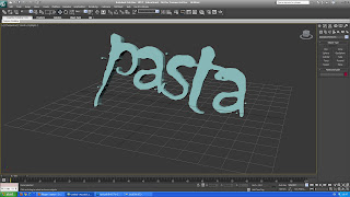
after that we made 3d typography. the way we did this was we clicked shapes and then a list came up so we selected the text option. then we clicked on the screen and then we chose modify. we went to modifier list and chose extrude. this made the text 3d. and after that we cloud move it and rotate it were we wanted
after we made a box and right clicked on it and chose convert to and then we chose convert to editable poly. we were then able to shape it by using the vertex and polygon tools. then we selected polygon and clicked the extrude box and then we were able to move each section of the box either out or inwards after we were finished moving the boxes we went to modifier list and selected turbo smooth this made the boxes edges smooth.


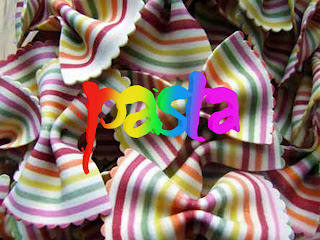
the way i made this image is i made my text in the 3d program and then i saved it as a png and opened it up in photoshop after that i got a picture off of the Internet and put it as a background. the way i coloured the text with a rainbow is i added a clipping mask above the text layer and coloured were i wanted the colours and then i just lowered the opacity
Subscribe to:
Posts (Atom)